New Trek Loves Hostile Architecture
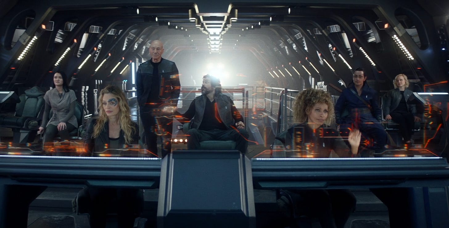
What’s the most obvious fact about these pictures that immediately jumps out at anyone that looks at it?
That’s right - no human in these scenes have ever spent a single minute in this bridge! They’ve never seen any of it. You can tell because their eyes aren’t bleeding.
You can tell because the actors continued to come back for a second day of shooting.
The only way a set like this works is if no one involved ever has to look at it. They’re in a comfortable 100% green room with some props to sit on/behind. This sort of environment is extremely hostile to humans that rely on seeing things.
(Yes, I was reminded of this by my previous post on hostile environments and how they can be used to keep humans away from places)
This is the bridge of the Enterprise of the new Star Trek series, Strange New Worlds. This is by far the most unrealistic thing about the series so far. There is only one canonically blind character in this show. One! And he’s not even usually on the bridge. No society made of seeing-abled humans would ever create such a room if people they don’t despise were expected to spend more than a few minutes there. No bridge crew would agree to work in these conditions. I am only subjected to this show 50 minutes at a time, spread out over many days, and I care barely stand it. I’m on edge after every viewing. This is NOT relaxing television. Can you imagine trying to do your day job in this sort of hell?
I’m seriously considering not watching another season because of this. I started to dread watching the next episode, and I completed the season only for completion’s sake. It’s OK otherwise, but this psychological assault is not worth it.
A welcoming place for humans has warm ample lighting that fully illuminates an area. It has surfaces that diffuse light and soften echoes. It says “I am safe to touch, I am meant to be interacted with.”
It does not have an infinite inky dark void that is outlined with the blinding glare of naked light-sources. It doesn’t burn after-images onto your retinas. It doesn’t distort depth perception with endless reflective surfaces and walls and edges that disappear into blackness. It doesn’t look like every surface is cold to the touch and will be marred by your skins oils. The floor doesn’t look like it’s made of smooth glass you have to balance on. The acoustics in there have to be nothing but distorted echoes and piercing tones.
I understand why Star Trek Discovery created a torture room for its bridge. It is the Grimdark Star Trek. It is supposed to make the audience feel apprehensive, on edge, like they are always in danger and that to rest for even a moment, even on the bridge, is suicidal folly.
I even kinda understand why Picard made all its human spaces hostile for humans - it’s a piece of crap show made by a bunch of asshats that don’t give a damn about creating anything of value for an SF viewer. The ship they all live in might as well be a mineshaft, why not?
But Strange New Worlds? This is supposed to be a return to a Trek that is humanist. Or at least pro-human. This is a federation that wants to make the galaxy a better place, not a torture chamber. What’s their excuse? Hell, they even have the old Enterprise bridge as a model.
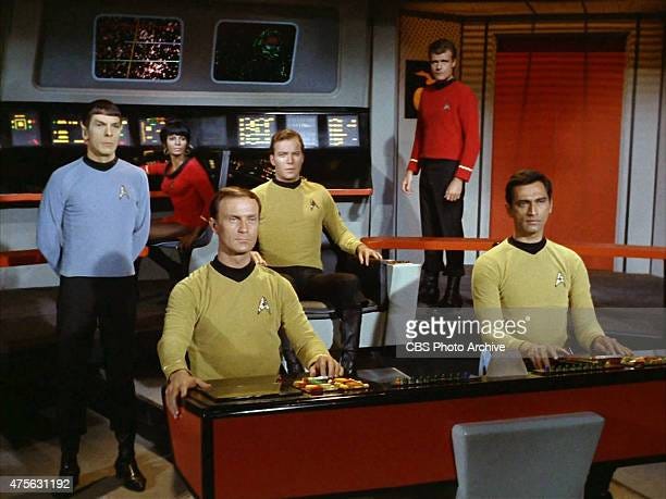
Obviously you don’t want to go with this. It’s outdated. It’s boxy. It looks cramped, like a place where space is at a premium (almost like a ship!) Honestly, the lighting isn’t great either. But at least it doesn’t look like it’s dangerous. You can tell where solid surfaces are. It may be kinda ugly, but it isn’t literally painful to the eyes. There are no glaring lights blinding you, interrogating you on last night’s whereabouts, and demanding you confess to murder.
And as cheap as it looks, the old TOS bridge looks less cheap than the Strange New Worlds bridge. They must’ve spent at least one real dollar to make that thing. The SNW bridge is just the Discovery bridge with a palette swap. (Come to think of it, this is probably SNW’s excuse for why their bridge is so ugly. They didn’t want to budget money for something as unimportant as making the place were the most action in the series would take place look decent.)
Watching actors obviously not interacting with anything around them looks cheap and fake.
For a really inviting bridge, look at the Enterprise D from Next Generation
Again, a bit dated by today’s standards. But notice the rounded corners. The carpeted floor. The diffuse lighting that brightly illuminates the whole room. The surfaces that look like they’re meant to be touched. This is a welcoming environment! This is a place that people can feel at home in. This is something a viewer could look forward to returning to, week after week.
And it’s something the actors can, and do, interact with constantly. They actually live on this set. Of course it had to be amenable to human life.
Message to SF visuals peeps — humans hate living in torture chambers! It’s immersion-breaking to have something so unbelievable presented without comment on screen. And it’s literally physically unpleasant for the audience to be subjected to. Do your dang job!


Yk they actually built the set right? They're not just making a CGI bridge? There's no green screen on the bridge except maybe for the big viewscreen. It is genuinely an environment that the actors talk incredibly positively about.
"Can you imagine trying to do your day job in this sort of hell?"
Yes, but only because I've been to Las Vegas.